The financial crisis that began with the default of Lehman Brothers hit the real economy hard worldwide, this is a fact. Now, with signs of recovery in various parts of the globe on the horizon, it is worth asking what is the current level of well-being/malaise of nations? What are the differences in terms of unemployment and inflation between countries? We propose a graphical analysis using theOkun index, a simple indicator given by the sum of the inflation rate and the unemployment rate (and also known as the “Misery Index”).
An increase in the Okun index, due to a higher inflation rate and/or rising unemployment, intuitively represents an increase in unease for society: imagine the situation of an unemployed person who sees the prices of goods and services they need. And vice versa, in the opposite case.
This indicator of well-being/malaise has been the subject of various criticisms. For example, it attributes equal weight to unemployment and inflation, placed on the same level, then it does not take into consideration the initial situation of the various economies. However, this index is useful for having a synthetic idea of the economic situation of various countries, by comparing them. Just what we intend to do, with all the limitations of the case.
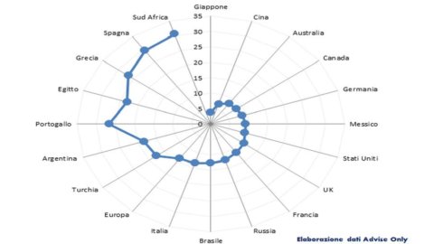
We have represented the state of malaise/well-being with a "radar graph" which reads as follows: each country has a "ray" on which the Okun index is placed, which is greater the further we are from the centre. Therefore, if you look at the graph, starting from the top (12 o'clock) and proceeding clockwise, you go from the countries that are better off to those that are worse off.
Who is better off? Japan, China, Australia, Canada, Germany. On the opposite side we find the countries of the periphery of the Eurozone and other countries of the "South of the world". Italy appears slightly better than the European average, mainly due to low inflation. (We repeat: Okun's index is not perfect…)
Note how the overall system has significant differences in terms of well-being; the Okun index in fact varies from 3.8 in Japan to 30.7 in South Africa.


